


But we do judge books by their covers
Behind the novel: 7

The admonition is almost universal. “Don’t judge a book by its cover.” Yeah right. When we’re wandering bookstores in search of our next great read, we actually do judge books by their covers. Maybe we shouldn’t. We almost certainly shouldn’t. But we do. So that means book covers are actually an important part of the publishing and bookselling worlds. I thought it might be interesting to have a look at some of my book covers and how they have evolved over time. Some of these have never been seen out here in the open.
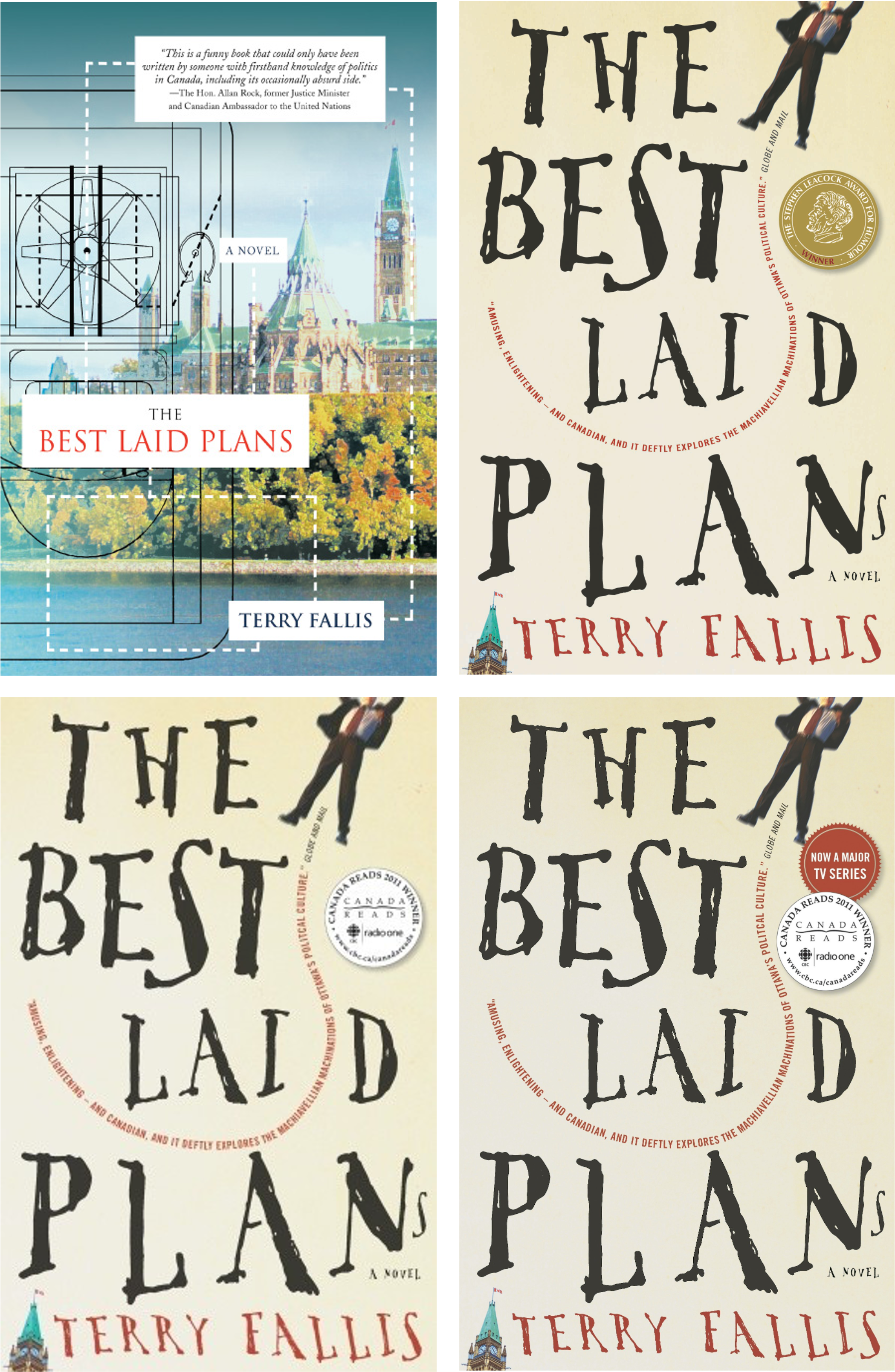
The Best Laid Plans
Let’s start at the beginning. If you’ve been with me here on Substack for a while, you’ll know that the first edition of The Best Laid Plans was in fact self-published. I still quite like the very first cover. The painting of Centre Block from the other side of the Ottawa River is actually a photograph that I supplied that was photoshopped to look like a painting. I developed the schematic design of the hovercraft on PowerPoint that is overlayed on the left hand side. The designers at the self-publishing house I used put it all together. In hindsight, the one knock against it is perhaps that the design does not convey that the novel is funny. There’s no wit.
After it won the Leacock medal and we signed with McClelland & Stewart, the great writer and award-winning book designer, Scott Richardson, created the new cover that I think does reflect the humour and whimsy of the novel. That is a custom font that Scott Richardson actually drew by hand. Very unusual. Another flash of creativity can be seen in the Globe & Mail blurb that curls around and ultimately through the word “Laid” in the title. And finally, the fact that a small “s” had to be crammed in at the bottom right, is a clever spasm of irony given the book’s title. Of course, Scott also included the Leacock Medal badge as another selling point.
When the novel miraculously won CBC’s Canada Reads in early 2011, a modified version of the cover was released with the Canada Reads badge pushing the Leacock Medal onto the back cover. There was one more iteration of the cover in 2013 when the “Now a major TV series” badge was added.
It is an unusual cover, but it certainly does draw your eye, which is exactly what Scott Richardson intended when he designed it.
Up and Down
For the life of me I couldn’t figure out what the M&S designers would come up with for the cover of Up and Down. There were several early designs that just didn’t seem to work. Eventually, the paper balanced on a pencil came to the fore. None of us really knows what it means, but there is rocket imagery which connected to the book.
On this, my third novel, the decision was made to put my name prominently at the top. This was not my idea. When I asked why, I was told it was because of Canada Reads. Apparently, it was to capitalize on the name recognition that Canada Reads confers on the lucky winner. M&S wanted to make sure readers knew I was the author of Up and Down, so they opted for this design. This placement of my name stayed there at the top until my eighth novel, Operation Angus.
In the three versions of the cover below, you can see the evolution from one edition to the next. In the first example, a blurb from Canada’s first astronaut is at the bottom while a reference to Canada Reads graces the very top. The second edition was also sold in the United States, so they opted for a blurb from then CNN Chief Business Correspondent Ali Velshi who had a higher profile south of the border. They also moved the Canada Reads reference on to the back cover, giving the front a slightly cleaner look. Finally, a new edition of Up and Down will be released in February with this new cover. I quite like it.

No Relation
I’ve always loved the original cover of No Relation that Terri Nimmo developed. Many have wondered what the two bear figures represent. Well, No Relation is a novel about people who live with famous names but aren’t famous themselves. So I figure the man in the bear suit represents a character with a famous name while the actual bear stands in for the real famous person. Clever, no? I’m grateful for the blurb at the top of the cover from my friend, Will Ferguson, not just a three-time Leacock Medal winner—as if that’s not enough—but a Giller prize winner to boot.
I confess, I’ve never loved the cover of the second edition of the novel. One of the minor characters in the story is a guy named Clark Kent, hence the imagery. But as you’ll see in the next section, it does kind of “dumb down” the more sophisticated look of the original cover. Finally, you’ll see below the Taiwanese cover of the novel. I’m not sure what to make of it, but I was thrilled to have a novel published in Taiwan.

Moving to a different look
After the first edition of No Relation, the team at M&S thought it would be a good idea to try to give my novels a consistent and recognizable look. The second edition of No Relation and my subsequent two novels all follow this same consistent approach, as you can see below.

But when Jared Bland joined Penguin Random House as the publisher of McClelland & Stewart in 2016, he felt my novels were more sophisticated and thoughtful than the somewhat cartoonish covers suggested, despite the sensible idea to give me a certain “look.” When he made this observation, I could only agree, though it had not really occurred to me before. So at his suggestion, we decided to depart from the more consistent but cartoonish “look” that had been developed for my covers up to, and including, my sixth novel, and move to a more sophisticated cover imagery.
Below is the first example of this evolution. When it came time to reprint my sixth novel, One Brother Shy, a new cover was designed by the wonderful Matthew Flute, guided by this new, more sophisticated, perhaps stylish (whatever that means) approach.
Albatross
Albatross was my first new novel—as opposed to a new edition of an older novel—to be designed with this new cover philosophy. I had no idea what the very creative designer—his name is Five Seventeen (I’m not kidding.)—would come up with. (My cover ideas tend to be far too literal so I gladly leave it to the professionals.)
The first design option below certainly honours the new more sophisticated look but was considered to be a little too abstract. The second version in the middle below, is striking. It was originally presented with a black background. I suggested a very dark green instead just to warm it up a bit, and that’s what we ended up using. I confess when I first saw it, I didn’t immediately understand the imagery. Then it hit me. In the novel, the narrator is blessed—or cursed—with a body that is perfectly suited for golf, even though he’d never played the game. In the end, he becomes the best golfer on the planet, with all the wealth and fame that comes with it. But all he’s ever really wanted is to be a writer.
So he is the classic bird in a gilded cage. Living in luxury, but unhappy and not really free to pursue his dream. I think the symbolism of the cover is brilliant. Nice job, Five Seventeen!
We went with a Globe & Mail blurb on the launch cover, but tweaked the design for the second edition replacing the original blurb with a “National Bestseller” banner at the bottom and then adding a lovely Linwood Barclay blurb at the top-right. Love it.

Operation Angus
M&S again tapped the talented Matthew Flute to design the cover for Operation Angus. The first two designs below were more abstract, but still high impact. I quite liked them, though I’d be hard-pressed to explain what they mean. The spider reference in the second design below represents the spider-like look of the new Samuel de Champlain Centre that is a critical location in the novel.
Eventually, the team opted for a less abstract design yielding the third version below. I really liked it, but noticed that the Peace Tower in the image was proportionally shorter than it ought to be. So Matthew made it a little taller and we added “A Novel” in the bottom-right. I really like the classic trench-coated spy figure on the roof of Centre Block. It instantly convey the idea that this is not another political satire like my first two novels featuring Angus McLintock and Daniel Addison, but more of a comic thriller. Finally, the team decided we’d dispense with blurbs on the cover to keep it clean. I like the colours and really like where we ended up with the cover.

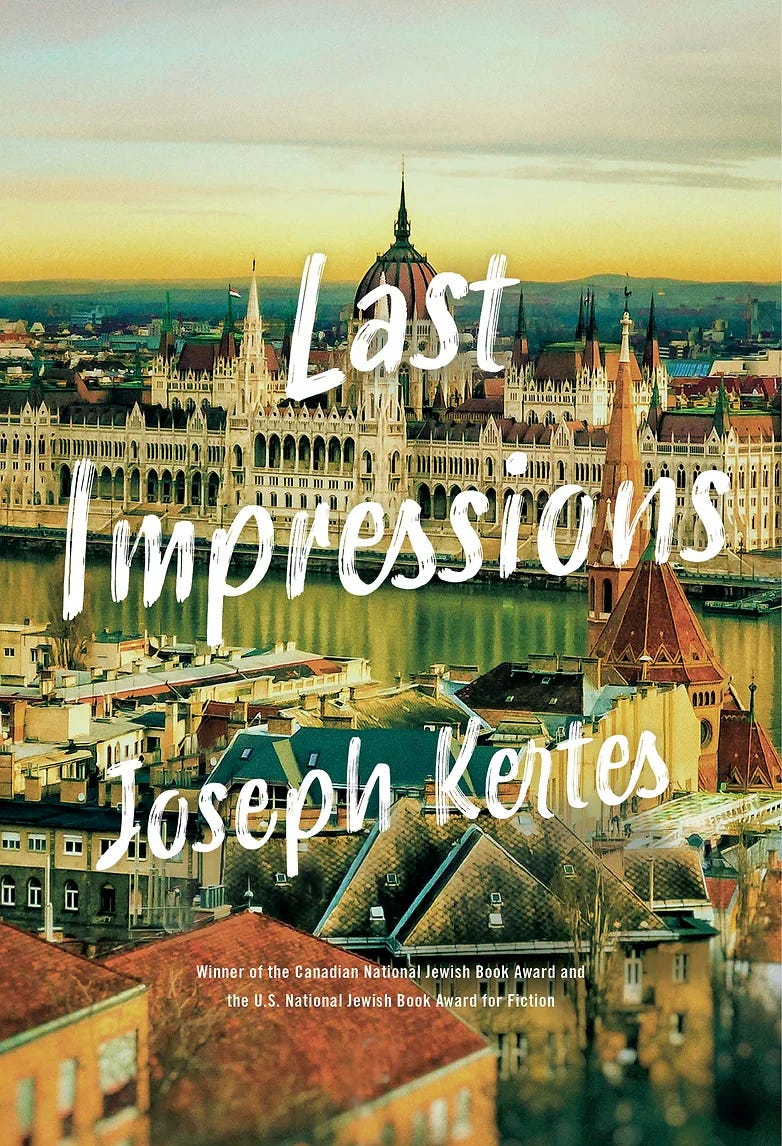
A favourite book cover
Enough about my novels, I thought I’d close with a favourite book cover from the last couple of years. I still pull this novel off my book shelf just to stare at the cover. Even if I didn’t already know Joe Kertes as a great friend and a wonderful writer, this cover would make me buy this book anyway. When I look at it, I just kind of fall into the scene and want to start reading—which is exactly what I did. And the novel itself surpasses even its glorious cover. A great read and a finalist for the 2021 Stephen Leacock Medal for Humour.
So there you go. A quick overview of the covers of at least some of my novels. I’ve been very happy with nearly all the cover designs I’ve been blessed to have. I’m already trying to conjure up what the cover of my next novel, A New Season, might look like. As usual, I have no idea.
Thanks for having a gander at this post. Here’s hoping you’ll consider subscribing—it’s free and easy. Just hit the Subscribe button below. See you in a week.
This was sooooo interesting!
The story behind the cover story. Fascinating!